Image Is Everything to Your Customers – jSinger Marketing Rebrand Pt. 2
Original jSinger Digital Marketing Tips & Commentary
Have you noticed in the past 5 years almost every McDonald’s and Wendy’s restaurant has knocked down its building and started again?
Why would they do this?
They know today’s customer, which responds to, “Image is everything.” They know a flashy, high-tech, fast double-drive-thru user experience is what attracts customers, even more than quality of food. Remember, it’s the same younger customer base that gets its news more from Instagram memes than CNN.
Small business owners think if they run a boring, business-to-business company, they don’t need to play this flashy, customer-focused game. They don’t need a nice logo, or a nice building, well-managed social media accounts or a strong digital marketing presence. They are wrong, and it’s hurting their revenue.
Just watch someone under 30 do a web search, and then visit two resulting websites. Each site will get a 2-3 second assessment, and the nicer looking website will always win the customer. It doesn’t matter if the uglier site had a better product or service. What matters is the prospect thinks the nicer looking site is a better product. And, in a way, they are right. If someone doesn’t take care of their website, or spend money on design, why would they show that effort in their products or services? It’s akin to a run-down McDonald’s vs. a newly updated one. Why would you pick the lesser?
To be taken seriously, you need to take design seriously.
For this reason, jSinger Marketing underwent a complete design and website revamp for its 10th anniversary this year. And, we took our own advice. The first thing we did was hand off the creative to a long-time associate of ours, Nate Baron. Nate has worked on other client projects, but even though I personally could do the design, I’m simply too close to it. It’s the same reason we love brainstorming with our clients. We can bring that outsider/customer point of view so much easier than they can.
Nate led the first step of the rebrand process, which is discovery and familiarization. He helped me dig deep into the brand of the company through introspective questions about company history, vision, strengths and more.
The goal was to convey who we are and what we do while also conveying professionalism and reliability we are known for. Nate’s interpretation worked perfectly: a simple and intuitive “suggestive search” logo that communicates who we are without saying a word.
| Old Logo: |
New Logo: |
This minimalistic vibe was carried out on the website as well, where the user is given site menu options that clearly describe what they’re looking for and what jSinger Marketing offers.
And it really is that simple: We serve our clients best by hearing their needs and communicating them clearly with beautiful aesthetic and thoughtful solutions.
For the website, Nate created a much more visually appealing site. Instead of making people click “Website Samples” or “Portfolio” (which itself is becoming a dated word) we showed designs throughout the pages.
Old Website: |
New Website: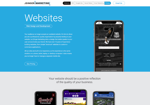 |
Collaboration with Nate also revealed an opportunity to create intuitive action by asking the user a simple question: What do you want to build? This straightforward and honest approach is a reflection of how we treat our customers. So instead of the old version (left) where someone could click aimlessly around 19 options, we now draw the eye to a single, center option to help guide them.
Old Home Page: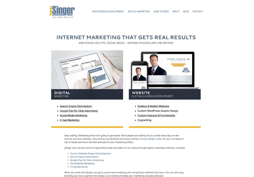 |
New Home Page: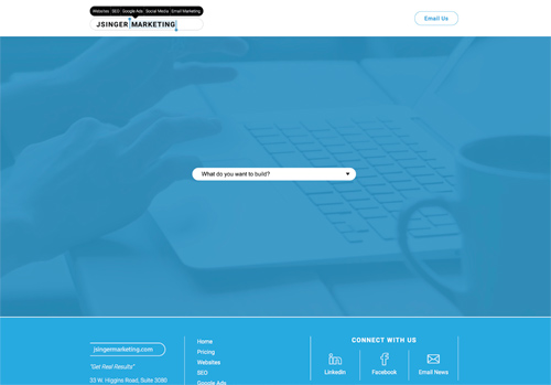 |
New Voice and Messaging
Our final of three posts about the jSinger Marketing rebrand will focus on our new messaging and pricing format. It is coming soon. It’s a dive into the changing customer landscape and I think the most important read of the three.